Magazine ad
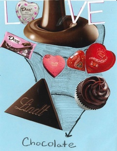
In this project, we had to create a magazine ad that shows elements and principles. The elements are line, and color, and the principles are balance and emphasis. For this ad, I cut out pictures of bags of candy or anything that had to do with chocolate. On the top, I cut out the word "Love" and then followed it with a line that shows "chocolate". I tried to use the line element with the picture of the chocolate that's drizzling down the middle, but that didn't really work. So instead, I drew lines leading to every picture and then lead it down to the word "chocolate". There really isn't any emphasis, but I tried to balance the pictures so there was an even amount on each side. I made blue the background because I thought it would be a nice pop of color with the colors of the packaging of the chocolate. With this project, I learned how to scan my ad, and also use the snipping tool to turn it into a jpeg image.
Windshield Flyers
For this project, we had to create three windshield flyer ads. One was a colored one using a template, the second had to be a blank template with a landscape orientation, and the last one had to be a recreation of one of the other ads, but in black and white.
The first one I designed was for the Somerset Fall Festival. I added when the event would occur and from what time that it would begin, and when it would end. I added what would be there such as candy and pumpkins. I tried to use balance by placing the same amount of images on each side. With the color, I was very happy that I was able to darken the background to fall-like colors or Halloween colors.
The second windshield ad was on a landscape orientation. I decided to make a haunted house opening for the month of October. I stated when it will be open and where it will be. I also added the times along with the phone number. I liked how the background gradient showed up very vibrant and I tried to show emphasis with the words "join if you dare" on the side of it to make that stand out. I don't really see a lot of balance in this one but I attempted to show emphasis.
For the last windshield ad, I decided to re-create my first ad. I included the same information, and added a few different images. I showed balance by placing two spider webs in opposite corners, and also with the black and white squares along the edges. I added more images that represented Halloween, and took up more space.
The main thing that I learned how to do for this project is how to create a flyer using Microsoft Publisher, and placing text over images.
TRi- FOld Brochure
For this project, we had to create a tri-fold brochure. We had to use a picture of our self and edit it in photoshop. Then we had to create a brochure on a company of our choice. For me, I chose a law office. I decided to use a lot of color and images to help take up space. I saturated my picture with a reddish color and brightened the image a little. With this project, I learned how to edit photos in Photoshop and how to create a brochure on one page.
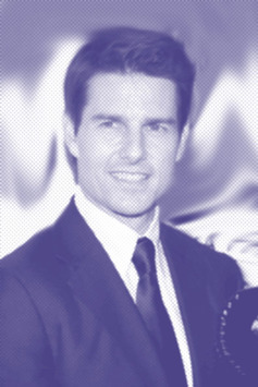
For this project, we were required to take an image of our favorite celebrity and use five different photoshop tools. I used a picture of Tom Cruise, simply because he is my favorite actor. I used both the smudge and blur tool to make him the main focus of the picture and not the background. I also used a neon glow to create the purple-like color. I saturated the color a little bit and also made the picture a little bit brighter
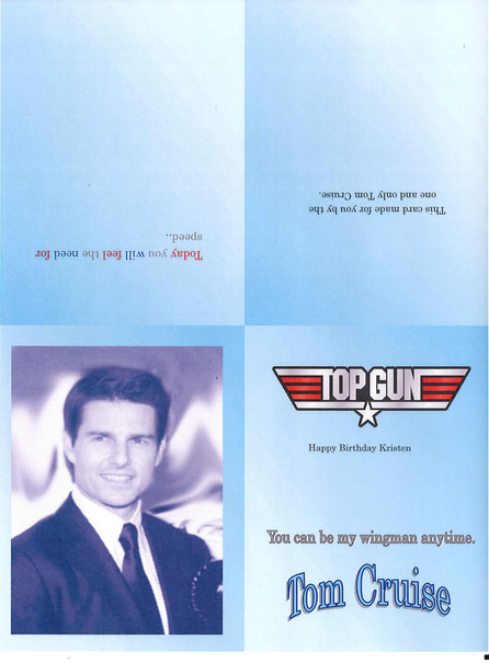
This is the actual birthday card I created. I used the photshopped image of Tom Cruise and then made a birthday card in Publisher. I included the Top Gun logo and one Top Gun quote
Thayer Street Brochure
For this project, we took a field trip to Thayer Street in Providence Rhode Island. We were put into groups of three or four and were given a specific subject to find businesses for. Our group was given beauty and fashion. So on Thayer Street we were required to find businesses that were related to this. With this, I edited some photos in Photoshop and put a little description next to the business where you could find these products. The main thing I did when photoshopping the pictures was increase/decrease the saturation levels and added a filter. I used the saturation to brighten the colors and darken the shadows.
These are the pictures I edited in Photoshop. The original photo is first and then the photoshopped picture is right after it.
